%matplotlib inline
Analyze Slide-seqV2 data
This tutorial shows how to apply Squidpy for the analysis of Slide-seqV2 data.
The data used here was obtained from [Stickels et al., 2020].
We provide a pre-processed subset of the data, in anndata.AnnData format.
We would like to thank @tudaga for providing cell-type level annotation.
For details on how it was pre-processed, please refer to the original paper.
Import packages & data
To run the notebook locally, create a conda environment as conda env create -f environment.yml using this
environment.yml <https://github.com/scverse/squidpy_notebooks/blob/main/environment.yml>_.
import squidpy as sq

print(f"squidpy=={sq.__version__}")

# load the pre-processed dataset
adata = sq.datasets.slideseqv2()
adata
squidpy==1.2.3
100%|██████████| 251M/251M [00:36<00:00, 7.15MB/s]
AnnData object with n_obs × n_vars = 41786 × 4000
    obs: 'barcode', 'x', 'y', 'n_genes_by_counts', 'log1p_n_genes_by_counts', 'total_counts', 'log1p_total_counts', 'pct_counts_in_top_50_genes', 'pct_counts_in_top_100_genes', 'pct_counts_in_top_200_genes', 'pct_counts_in_top_500_genes', 'total_counts_MT', 'log1p_total_counts_MT', 'pct_counts_MT', 'n_counts', 'leiden', 'cluster'
    var: 'MT', 'n_cells_by_counts', 'mean_counts', 'log1p_mean_counts', 'pct_dropout_by_counts', 'total_counts', 'log1p_total_counts', 'n_cells', 'highly_variable', 'highly_variable_rank', 'means', 'variances', 'variances_norm'
    uns: 'cluster_colors', 'hvg', 'leiden', 'leiden_colors', 'neighbors', 'pca', 'spatial_neighbors', 'umap'
    obsm: 'X_pca', 'X_umap', 'deconvolution_results', 'spatial'
    varm: 'PCs'
    obsp: 'connectivities', 'distances', 'spatial_connectivities', 'spatial_distances'
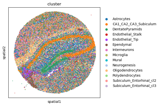
First, let’s visualize cluster annotation in spatial context
with squidpy.pl.spatial_scatter().
sq.pl.spatial_scatter(adata, color="cluster", size=1, shape=None)
WARNING: Please specify a valid `library_id` or set it permanently in `adata.uns['spatial']`
Neighborhood enrichment analysis
Similar to other spatial data, we can investigate spatial organization of clusters
in a quantitative way, by computing a neighborhood enrichment score.
You can compute such score with the following function: squidpy.gr.nhood_enrichment().
In short, it’s an enrichment score on spatial proximity of clusters:
if spots belonging to two different clusters are often close to each other,
then they will have a high score and can be defined as being enriched.
On the other hand, if they are far apart, the score will be low
and they can be defined as depleted.
This score is based on a permutation-based test, and you can set
the number of permutations with the n_perms argument (default is 1000).
Since the function works on a connectivity matrix, we need to compute that as well.
This can be done with squidpy.gr.spatial_neighbors().
Please see Building spatial neighbors graph and
Neighbors enrichment analysis for more details
of how these functions works.
Finally, we’ll directly visualize the results with squidpy.pl.nhood_enrichment().
We’ll add a dendrogram to the heatmap computed with linkage method ward.
sq.gr.spatial_neighbors(adata, coord_type="generic")
sq.gr.nhood_enrichment(adata, cluster_key="cluster")
sq.pl.nhood_enrichment(
    adata, cluster_key="cluster", method="single", cmap="inferno", vmin=-50, vmax=100
)
100%|██████████| 1000/1000 [00:09<00:00, 110.64/s]
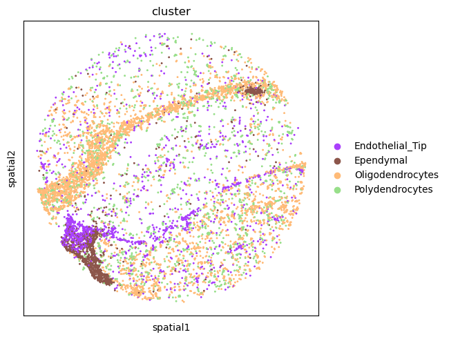
Interestingly, there seems to be an enrichment between the Endothelial_Tip,
the Ependymal cells. Another putative enrichment is between the Oligodendrocytes
and Polydendrocytes cells. We can visualize the spatial organization of such clusters.
For this, we’ll use squidpy.pl.spatial_scatter() again.
sq.pl.spatial_scatter(
    adata,
    shape=None,
    color="cluster",
    groups=["Endothelial_Tip", "Ependymal", "Oligodendrocytes", "Polydendrocytes"],
    size=3,
)
WARNING: Please specify a valid `library_id` or set it permanently in `adata.uns['spatial']`
Ripley’s statistics
In addition to the neighbor enrichment score, we can further investigate spatial
organization of cell types in tissue by means of the Ripley’s statistics.
Ripley’s statistics allow analyst to evaluate whether a discrete annotation (e.g. cell-type)
appears to be clustered, dispersed or randomly distributed on the area of interest.
In Squidpy, we implement three closely related Ripley’s statistics, that can be
easily computed with squidpy.gr.ripley(). Here, we’ll showcase the Ripley’s L statistic,
which is a variance-stabilized version of the Ripley’s K statistics.
We’ll visualize the results with squidpy.pl.ripley().
Check Compute Ripley’s statistics for more details.
mode = "L"
sq.gr.ripley(adata, cluster_key="cluster", mode=mode, max_dist=500)
sq.pl.ripley(adata, cluster_key="cluster", mode=mode)
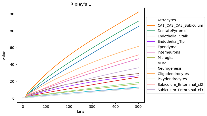
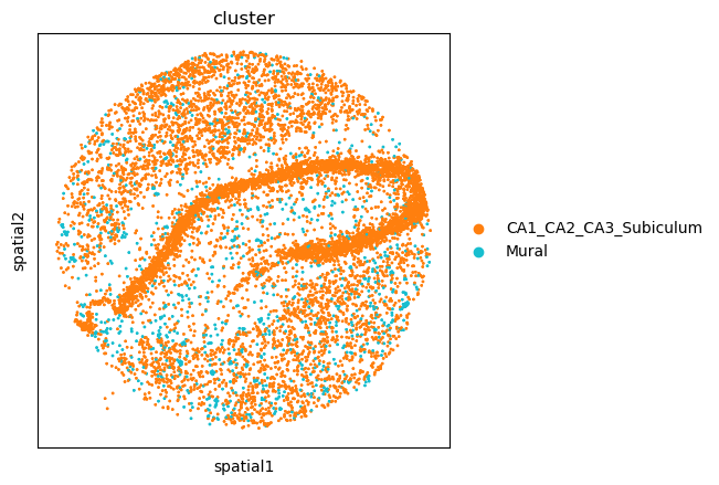
The plot highlight how some cell-types have a more clustered pattern, like Astrocytes and CA11_CA2_CA3_Subiculum cells, whereas other have a more dispersed pattern, like Mural cells. To confirm such interpretation, we can selectively visualize again their spatial organization.
sq.pl.spatial_scatter(
    adata,
    color="cluster",
    groups=["Mural", "CA1_CA2_CA3_Subiculum"],
    size=3,
    shape=None,
)
WARNING: Please specify a valid `library_id` or set it permanently in `adata.uns['spatial']`
Ligand-receptor interaction analysis
The analysis showed above has provided us with quantitative information on
cellular organization and communication at the tissue level.
We might be interested in getting a list of potential candidates that might be driving
such cellular communication.
This naturally translates in doing a ligand-receptor interaction analysis.
In Squidpy, we provide a fast re-implementation the popular method CellPhoneDB [Efremova et al., 2020]
(code <https://github.com/Teichlab/cellphonedb>_ )
and extended its database of annotated ligand-receptor interaction pairs with
the popular database Omnipath [Türei et al., 2016].
You can run the analysis for all clusters pairs, and all genes (in seconds,
without leaving this notebook), with squidpy.gr.ligrec().
Let’s perform the analysis and visualize the result for three clusters of
interest: Polydendrocytes and Oligodendrocytes.
For the visualization, we will filter out annotations
with low-expressed genes (with the means_range argument)
and decreasing the threshold
for the adjusted p-value (with the alpha argument)
Check Receptor-ligand analysis for more details.
sq.gr.ligrec(
    adata,
    n_perms=100,
    cluster_key="cluster",
    clusters=["Polydendrocytes", "Oligodendrocytes"],
)
sq.pl.ligrec(
    adata,
    cluster_key="cluster",
    source_groups="Oligodendrocytes",
    target_groups=["Polydendrocytes"],
    pvalue_threshold=0.05,
    swap_axes=True,
)
100%|██████████| 100/100 [00:07<00:00, 13.48permutation/s]

The dotplot visualization provides an interesting set of candidate interactions that could be involved in the tissue organization of the cell types of interest. It should be noted that this method is a pure re-implementation of the original permutation-based test, and therefore retains all its caveats and should be interpreted accordingly.
Spatially variable genes with spatial autocorrelation statistics
Lastly, with Squidpy we can investigate spatial variability of gene expression.
squidpy.gr.spatial_autocorr() conveniently wraps two
spatial autocorrelation statistics: Moran’s I and Geary’s C*.
They provide a score on the degree of spatial variability of gene expression.
The statistic as well as the p-value are computed for each gene, and FDR correction
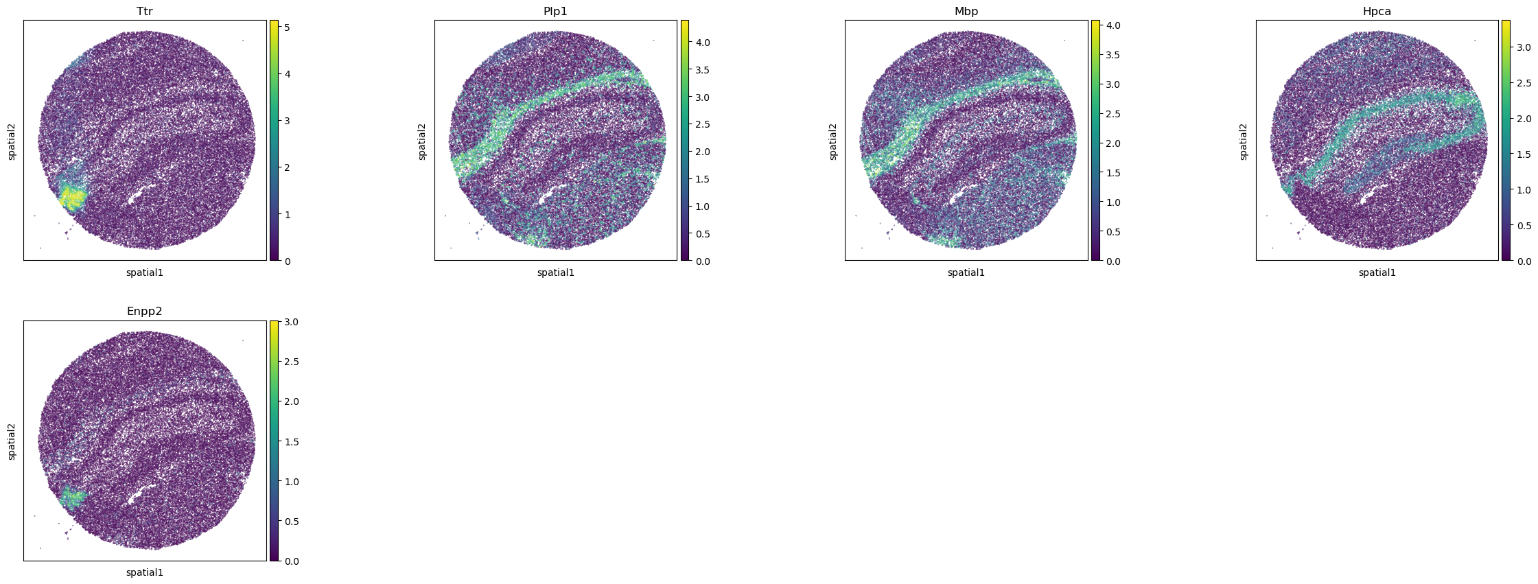
is performed. For the purpose of this tutorial, let’s compute the Moran’s I score.
See Compute Moran’s I score for more details.
sq.gr.spatial_autocorr(adata, mode="moran")
adata.uns["moranI"].head(10)
| I | pval_norm | var_norm | pval_norm_fdr_bh | |
|---|---|---|---|---|
| Ttr | 0.703289 | 0.0 | 0.000008 | 0.0 |
| Plp1 | 0.531680 | 0.0 | 0.000008 | 0.0 |
| Mbp | 0.495970 | 0.0 | 0.000008 | 0.0 |
| Hpca | 0.490302 | 0.0 | 0.000008 | 0.0 |
| Enpp2 | 0.455090 | 0.0 | 0.000008 | 0.0 |
| 1500015O10Rik | 0.453225 | 0.0 | 0.000008 | 0.0 |
| Pcp4 | 0.428500 | 0.0 | 0.000008 | 0.0 |
| Sst | 0.398053 | 0.0 | 0.000008 | 0.0 |
| Ptgds | 0.385718 | 0.0 | 0.000008 | 0.0 |
| Nrgn | 0.368533 | 0.0 | 0.000008 | 0.0 |
The results are stored in adata.uns["moranI"] and we can visualize selected genes
with squidpy.pl.spatial_scatter().
sq.pl.spatial_scatter(
    adata,
    shape=None,
    color=["Ttr", "Plp1", "Mbp", "Hpca", "Enpp2"],
    size=0.1,
)
WARNING: Please specify a valid `library_id` or set it permanently in `adata.uns['spatial']`