Analyze Vizgen data
from pathlib import Path

import numpy as np
import pandas as pd

import matplotlib.pyplot as plt
import seaborn as sns

import scanpy as sc
import squidpy as sq

sc.logging.print_header()
scanpy==1.9.0 anndata==0.8.0 umap==0.5.3 numpy==1.23.5 scipy==1.10.0 pandas==1.5.3 scikit-learn==1.2.1 statsmodels==0.13.5 python-igraph==0.10.3 pynndescent==0.5.8
Download the data from Vizgen MERFISH Mouse Brain Receptor Dataset. Unpack the .tar.gz file. The dataset contains a MERFISH measurement of a gene panel containing 483 total genes including canonical brain cell type markers, GPCRs, and RTKs measured on 3 full coronal slices across 3 biological replicates. This is one slice of replicate 1.
Unfortunately, the data needs to be downloaded manually. You need these 3 files in a new folder tutorial_data in the same path as your notebook.
datasets_mouse_brain_map_BrainReceptorShowcase_Slice1_Replicate1_cell_by_gene_S1R1.csvdatasets_mouse_brain_map_BrainReceptorShowcase_Slice1_Replicate1_cell_metadata_S1R1.csvdatasets_mouse_brain_map_BrainReceptorShowcase_Slice1_Replicate1_images_micron_to_mosaic_pixel_transform.csvThe last file should be in theimagesfolder.
The following lines create the folder structure which can be use to load the data.
# # # Download and unpack the Vizgen data
# !mkdir tutorial_data
# !mkdir tutorial_data/vizgen_data
# !mkdir tutorial_data/vizgen_data/images
vizgen_dir = Path().resolve() / "tutorial_data" / "vizgen_data"

adata = sq.read.vizgen(
    path=vizgen_dir,
    counts_file="datasets_mouse_brain_map_BrainReceptorShowcase_Slice1_Replicate1_cell_by_gene_S1R1.csv",
    meta_file="datasets_mouse_brain_map_BrainReceptorShowcase_Slice1_Replicate1_cell_metadata_S1R1.csv",
    transformation_file="datasets_mouse_brain_map_BrainReceptorShowcase_Slice1_Replicate1_images_micron_to_mosaic_pixel_transform.csv",
)
Calculate quality control metrics
Calculate the quality control metrics on the anndata.AnnData using scanpy.pp.calculate_qc_metrics.
sc.pp.calculate_qc_metrics(adata, percent_top=(50, 100, 200, 300), inplace=True)
The percentage of unassigned “blank” transcripts can be calculated from the dataframe saved in adata.obsm["blank_genes"]. This can later be used to estimate false discovery rate.
adata.obsm["blank_genes"].to_numpy().sum() / adata.var["total_counts"].sum() * 100
0.3892738837748766
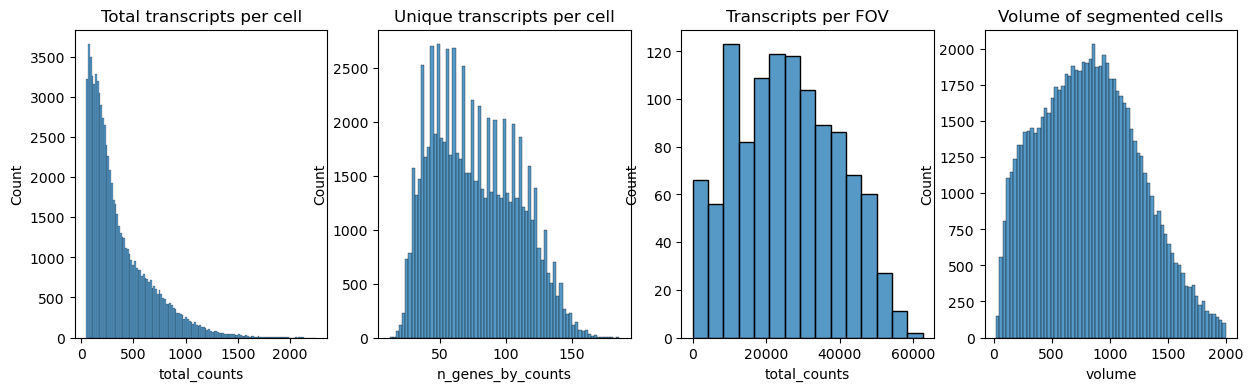
Next we plot the distribution of total transcripts per cell, unique transcripts per cell, transcripts per FOV and the volume of the segmented cells
fig, axs = plt.subplots(1, 4, figsize=(15, 4))

axs[0].set_title("Total transcripts per cell")
sns.histplot(
    adata.obs["total_counts"],
    kde=False,
    ax=axs[0],
)

axs[1].set_title("Unique transcripts per cell")
sns.histplot(
    adata.obs["n_genes_by_counts"],
    kde=False,
    ax=axs[1],
)

axs[2].set_title("Transcripts per FOV")
sns.histplot(
    adata.obs.groupby("fov").sum()["total_counts"],
    kde=False,
    ax=axs[2],
)

axs[3].set_title("Volume of segmented cells")
sns.histplot(
    adata.obs["volume"],
    kde=False,
    ax=axs[3],
)
<AxesSubplot: title={'center': 'Volume of segmented cells'}, xlabel='volume', ylabel='Count'>
All cells that do not contain at least 10 transcripts are filtered out with sc.pp.filter_cells
Genes could similiarly be filtered with sc.pp.filter_genes.
Values should be determined from distribution graphs.
Other filter criteria might be volume, stain signal like DAPI or a minimum of unique transcripts.
sc.pp.filter_cells(adata, min_counts=10)
Normalize counts per cell using scanpy.pp.normalize_total. Alternatively, counts could also be normalized by volume.
Logarithmize, do principal component analysis, compute a neighborhood graph of the observations using scanpy.pp.log1p, scanpy.pp.pca and scanpy.pp.neighbors respectively.
Use scanpy.tl.umap to embed the neighborhood graph of the data and cluster the cells into subgroups employing scanpy.tl.leiden.
You may have to install scikit-misc package for highly variable genes identification.
# !pip install scikit-misc
adata.layers["counts"] = adata.X.copy()
sc.pp.highly_variable_genes(adata, flavor="seurat_v3", n_top_genes=4000)
sc.pp.normalize_total(adata, inplace=True)
sc.pp.log1p(adata)
sc.pp.pca(adata)
sc.pp.neighbors(adata)
sc.tl.umap(adata)
sc.tl.leiden(adata)
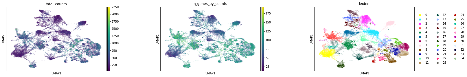
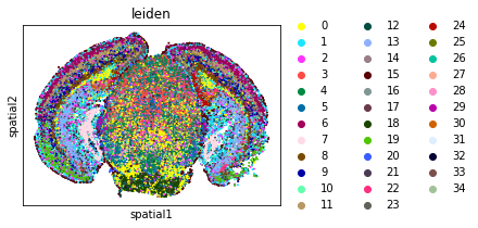
Visualize annotation on UMAP and spatial coordinates
Subplot with scatter plot in UMAP (Uniform Manifold Approximation and Projection) basis. The embedded points were colored, respectively, according to the total counts, number of genes by counts, and leiden clusters in each of the subplots. This gives us some idea of what the data looks like.
sc.pl.umap(
    adata,
    color=[
        "total_counts",
        "n_genes_by_counts",
        "leiden",
    ],
    wspace=0.4,
)
sq.pl.spatial_scatter(
    adata,
    shape=None,
    color=[
        "leiden",
    ],
    wspace=0.4,
)
WARNING: Please specify a valid `library_id` or set it permanently in `adata.uns['spatial']`
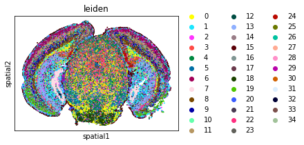
From this point clusters can be annotated by differentially expressed genes, e.g. sc.tl.rank_genes_groupsor by integrating scRNA and transferring labels e.g. Tangram or Harmony.
Computation of spatial statistics
Building the spatial neighbors graphs
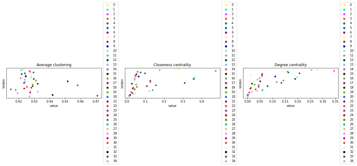
This example shows how to compute centrality scores, given a spatial graph and cell type annotation.
The scores calculated are closeness centrality, degree centrality and clustering coefficient with the following properties:
closeness centrality - measure of how close the group is to other nodes.
clustering coefficient - measure of the degree to which nodes cluster together.
degree centrality - fraction of non-group members connected to group members.
All scores are descriptive statistics of the spatial graph.
This dataset contains Leiden cluster groups’ annotations in anndata.AnnData.obs, which are used for calculation of centrality scores.
First, we need to compute a connectivity matrix from spatial coordinates to calculate the centrality scores. We can use squidpy.gr.spatial_neighbors for this purpose. We use the coord_type="generic" based on the data and the neighbors are classified with Delaunay triangulation by specifying delaunay=True.
sq.gr.spatial_neighbors(adata, coord_type="generic", delaunay=True)
Compute centrality scores
Centrality scores are calculated with squidpy.gr.centrality_scores, with the Leiden groups as clusters.
sq.gr.centrality_scores(adata, cluster_key="leiden")
The results were visualized by plotting the average centrality, closeness centrality, and degree centrality using squidpy.pl.centrality_scores.
sq.pl.centrality_scores(adata, cluster_key="leiden", figsize=(16, 5))
/Users/giovanni.palla/miniconda3/envs/squidpy/lib/python3.8/site-packages/IPython/core/pylabtools.py:134: UserWarning: constrained_layout not applied because axes sizes collapsed to zero.  Try making figure larger or axes decorations smaller.
  fig.canvas.print_figure(bytes_io, **kw)
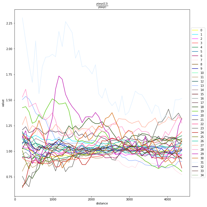
Compute co-occurrence probability
This example shows how to compute the co-occurrence probability.
The co-occurrence score is defined as:
where \(p(exp|cond)\) is the conditional probability of observing a cluster \(exp\) conditioned on the presence of a cluster \(cond\), whereas \(p(exp)\) is the probability of observing \(exp\) in the radius size of interest. The score is computed across increasing radii size around each cell in the tissue.
We can compute the co-occurrence score with squidpy.gr.co_occurrence.
Results of co-occurrence probability ratio can be visualized with squidpy.pl.co_occurrence. The ‘3’ in the \(\frac{p(exp|cond)}{p(exp)}\) represents a Leiden clustered group.
We can further visualize tissue organization in spatial coordinates with squidpy.pl.spatial_scatter, with an overlay of the expressed genes which were colored in consonance with the Leiden clusters.
adata_subsample = sc.pp.subsample(adata, fraction=0.5, copy=True)
sq.gr.co_occurrence(
    adata_subsample,
    cluster_key="leiden",
)
sq.pl.co_occurrence(
    adata_subsample,
    cluster_key="leiden",
    clusters="12",
    figsize=(10, 10),
)
sq.pl.spatial_scatter(
    adata_subsample,
    color="leiden",
    shape=None,
    size=2,
)
WARNING: `n_splits` was automatically set to `20` to prevent `39164x39164` distance matrix from being created
100%|█| 210/210 [01:26<00:00, 2.
WARNING: Please specify a valid `library_id` or set it permanently in `adata.uns['spatial']`
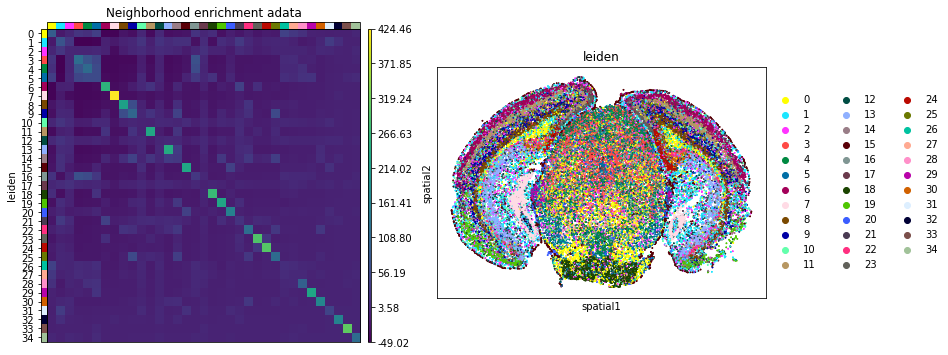
Neighbors enrichment analysis
This example shows how to run the neighbors enrichment analysis routine.
It calculates an enrichment score based on proximity on the connectivity graph of cell clusters. The number of observed events is compared against \(N\) permutations and a z-score is computed.
This dataset contains cell type annotations in anndata.Anndata.obs which are used for calculation of the neighborhood enrichment. We calculate the neighborhood enrichment score with squidpy.gr.nhood_enrichment.
sq.gr.nhood_enrichment(adata, cluster_key="leiden")
100%|█| 1000/1000 [00:14<00:00, 6
And visualize the results with squidpy.pl.nhood_enrichment.
fig, ax = plt.subplots(1, 2, figsize=(13, 7))
sq.pl.nhood_enrichment(
    adata,
    cluster_key="leiden",
    figsize=(8, 8),
    title="Neighborhood enrichment adata",
    ax=ax[0],
)
sq.pl.spatial_scatter(adata_subsample, color="leiden", shape=None, size=2, ax=ax[1])
WARNING: Please specify a valid `library_id` or set it permanently in `adata.uns['spatial']`
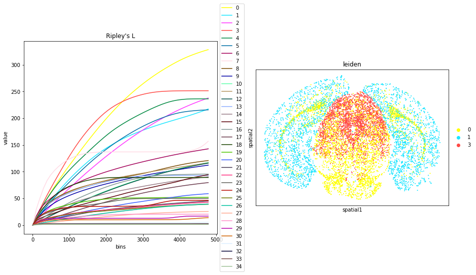
Compute Ripley’s statistics
This example shows how to compute the Ripley’s L function.
The Ripley’s L function is a descriptive statistics function generally used to determine whether points have a random, dispersed or clustered distribution pattern at certain scale. The Ripley’s L is a variance-normalized version of the Ripley’s K statistic. There are also 2 other Ripley’s statistics available (that are closely related): ‘G’ and ‘F’.
Ripley’s G monitors the portion of points for which the nearest neighbor is within a given distance threshold, and plots that cumulative percentage against the increasing distance radii.
For increasing separation range, Ripley’s F function assembles the percentage of points which can be found in the aforementioned range from an arbitrary point pattern spawned in the expanse of the noticed pattern.
We can compute the Ripley’s L function with squidpy.gr.ripley.
Results can be visualized with squidpy.pl.ripley. The other Ripley’s statistics can be specified using mode = 'G' or mode = 'F'.
fig, ax = plt.subplots(1, 2, figsize=(15, 7))
mode = "L"

sq.gr.ripley(adata, cluster_key="leiden", mode=mode)
sq.pl.ripley(adata, cluster_key="leiden", mode=mode, ax=ax[0])

sq.pl.spatial_scatter(
    adata_subsample,
    color="leiden",
    groups=["0", "1", "3"],
    shape=None,
    size=2,
    ax=ax[1],
)
WARNING: Please specify a valid `library_id` or set it permanently in `adata.uns['spatial']`
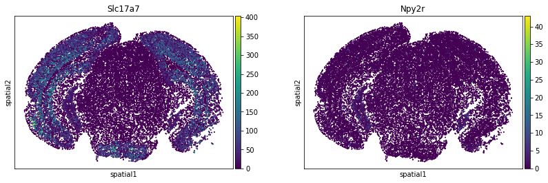
Compute Moran’s I score
This example shows how to compute the Moran’s I global spatial auto-correlation statistics.
The Moran’s I global spatial auto-correlation statistics evaluates whether features (i.e. genes) shows a pattern that is clustered, dispersed or random in the tissue are under consideration.
We can compute the Moran’s I score with squidpy.gr.spatial_autocorr and mode = 'moran'. We first need to compute a spatial graph with squidpy.gr.spatial_neighbors. We will also subset the number of genes to evaluate.
sq.gr.spatial_neighbors(adata_subsample, coord_type="generic", delaunay=True)
sq.gr.spatial_autocorr(
    adata_subsample,
    mode="moran",
    n_perms=100,
    n_jobs=1,
)
adata_subsample.uns["moranI"].head(10)
100%|██████████| 100/100 [18:37<00:00, 11.17s/]
| I | pval_norm | var_norm | pval_z_sim | pval_sim | var_sim | pval_norm_fdr_bh | pval_z_sim_fdr_bh | pval_sim_fdr_bh | |
|---|---|---|---|---|---|---|---|---|---|
| Slc17a7 | 0.741794 | 0.0 | 0.000012 | 0.0 | 0.009901 | 0.000026 | 0.0 | 0.0 | 0.014935 |
| Chrm1 | 0.645018 | 0.0 | 0.000012 | 0.0 | 0.009901 | 0.000018 | 0.0 | 0.0 | 0.014935 |
| Gfap | 0.578457 | 0.0 | 0.000012 | 0.0 | 0.009901 | 0.000017 | 0.0 | 0.0 | 0.014935 |
| Baiap2 | 0.478913 | 0.0 | 0.000012 | 0.0 | 0.009901 | 0.000016 | 0.0 | 0.0 | 0.014935 |
| Sstr4 | 0.464468 | 0.0 | 0.000012 | 0.0 | 0.009901 | 0.000020 | 0.0 | 0.0 | 0.014935 |
| Glp2r | 0.458457 | 0.0 | 0.000012 | 0.0 | 0.009901 | 0.000022 | 0.0 | 0.0 | 0.014935 |
| Mas1 | 0.448021 | 0.0 | 0.000012 | 0.0 | 0.009901 | 0.000021 | 0.0 | 0.0 | 0.014935 |
| Grin2b | 0.441957 | 0.0 | 0.000012 | 0.0 | 0.009901 | 0.000013 | 0.0 | 0.0 | 0.014935 |
| Gprc5b | 0.427084 | 0.0 | 0.000012 | 0.0 | 0.009901 | 0.000013 | 0.0 | 0.0 | 0.014935 |
| Npy2r | 0.426206 | 0.0 | 0.000012 | 0.0 | 0.009901 | 0.000019 | 0.0 | 0.0 | 0.014935 |
We can visualize some of those genes with squidpy.pl.spatial_scatter. We could also pass mode = 'geary' to compute a closely related auto-correlation statistic, Geary’s C. See squidpy.gr.spatial_autocorr for more information.
sq.pl.spatial_scatter(
    adata_subsample,
    color=[
        "Slc17a7",
        "Npy2r",
    ],
    shape=None,
    size=2,
    img=False,
)
WARNING: Please specify a valid `library_id` or set it permanently in `adata.uns['spatial']`