%matplotlib inline
Analyze Visium H&E data
This tutorial shows how to apply Squidpy for the analysis of Visium spatial transcriptomics data.
The dataset used here consists of a Visium slide of a coronal section of the mouse brain.
The original dataset is publicly available at the
10x Genomics dataset portal <https://support.10xgenomics.com/spatial-gene-expression/datasets>_ .
Here, we provide a pre-processed dataset, with pre-annotated clusters, in AnnData format and the
tissue image in squidpy.im.ImageContainer format.
A couple of notes on pre-processing:
- The pre-processing pipeline is the same as the one shown in the original
  `Scanpy tutorial <https://scanpy-tutorials.readthedocs.io/en/latest/spatial/basic-analysis.html>`_ .
- The cluster annotation was performed using several resources, such as the
  `Allen Brain Atlas <https://mouse.brain-map.org/experiment/thumbnails/100048576?image_type=atlas>`_ ,
  the `Mouse Brain gene expression atlas <http://mousebrain.org/>`_ from
  the Linnarson lab and this recent `pre-print <https://www.biorxiv.org/content/10.1101/2020.07.24.219758v1>`_ .
Import packages & data
To run the notebook locally, create a conda environment as conda env create -f environment.yml using this
environment.yml <https://github.com/scverse/squidpy_notebooks/blob/main/environment.yml>_.
import numpy as np
import pandas as pd

import anndata as ad
import scanpy as sc
import squidpy as sq

sc.logging.print_header()
print(f"squidpy=={sq.__version__}")

# load the pre-processed dataset
img = sq.datasets.visium_hne_image()
adata = sq.datasets.visium_hne_adata()
scanpy==1.9.2 anndata==0.8.0 umap==0.5.3 numpy==1.23.5 scipy==1.9.3 pandas==1.5.1 scikit-learn==1.1.3 statsmodels==0.13.2 python-igraph==0.10.2 pynndescent==0.5.7
squidpy==1.2.3
100%|██████████| 314M/314M [00:45<00:00, 7.19MB/s]
First, let’s visualize cluster annotation in spatial context
with squidpy.pl.spatial_scatter().
sq.pl.spatial_scatter(adata, color="cluster")
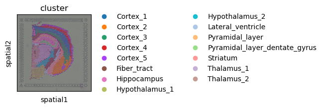
Image features
Visium datasets contain high-resolution images of the tissue that was used for the gene extraction.
Using the function squidpy.im.calculate_image_features() you can calculate image features
for each Visium spot and create a obs x features matrix in adata that can then be analyzed together
with the obs x gene gene expression matrix.
By extracting image features we are aiming to get both similar and complementary information to the gene expression values. Similar information is for example present in the case of a tissue with two different cell types whose morphology is different. Such cell type information is then contained in both the gene expression values and the tissue image features.
Squidpy contains several feature extractors and a flexible pipeline of calculating features
of different scales and sizes.
There are several detailed examples of how to use squidpy.im.calculate_image_features().
Extract image features provides a good starting point for learning more.
Here, we will extract summary features at different crop sizes and scales to allow
the calculation of multi-scale features and segmentation features.
For more information on the summary features,
also refer to Extract summary features.
# calculate features for different scales (higher value means more context)
for scale in [1.0, 2.0]:
    feature_name = f"features_summary_scale{scale}"
    sq.im.calculate_image_features(
        adata,
        img.compute(),
        features="summary",
        key_added=feature_name,
        n_jobs=4,
        scale=scale,
    )


# combine features in one dataframe
adata.obsm["features"] = pd.concat(
    [adata.obsm[f] for f in adata.obsm.keys() if "features_summary" in f],
    axis="columns",
)
# make sure that we have no duplicated feature names in the combined table
adata.obsm["features"].columns = ad.utils.make_index_unique(
    adata.obsm["features"].columns
)
100%|██████████| 2688/2688 [00:17<00:00, 157.76/s]
100%|██████████| 2688/2688 [00:24<00:00, 109.66/s]
We can use the extracted image features to compute a new cluster annotation. This could be useful to gain insights in similarities across spots based on image morphology.
# helper function returning a clustering
def cluster_features(features: pd.DataFrame, like=None) -> pd.Series:
    """
    Calculate leiden clustering of features.

    Specify filter of features using `like`.
    """
    # filter features
    if like is not None:
        features = features.filter(like=like)
    # create temporary adata to calculate the clustering
    adata = ad.AnnData(features)
    # important - feature values are not scaled, so need to scale them before PCA
    sc.pp.scale(adata)
    # calculate leiden clustering
    sc.pp.pca(adata, n_comps=min(10, features.shape[1] - 1))
    sc.pp.neighbors(adata)
    sc.tl.leiden(adata)

    return adata.obs["leiden"]


# calculate feature clusters
adata.obs["features_cluster"] = cluster_features(adata.obsm["features"], like="summary")

# compare feature and gene clusters
sq.pl.spatial_scatter(adata, color=["features_cluster", "cluster"])
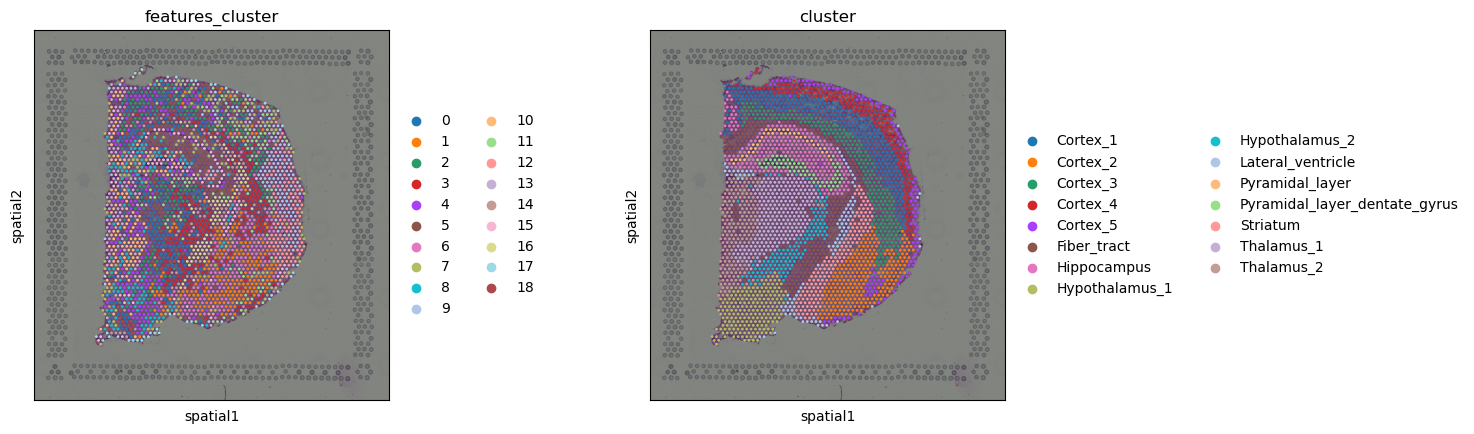
Comparing gene and feature clusters, we notice that in some regions, they look very similar, like the cluster Fiber_tract, or clusters around the Hippocampus seems to be roughly recapitulated by the clusters in image feature space. In others, the feature clusters look different, like in the cortex, where the gene clusters show the layered structure of the cortex, and the features clusters rather seem to show different regions of the cortex.
This is only a simple, comparative analysis of the image features, note that you could also use the image features to e.g. compute a common image and gene clustering by computing a shared neighbors graph (for instance on concatenated PCAs on both feature spaces).
Spatial statistics and graph analysis
Similar to other spatial data, we can investigate spatial organization by leveraging spatial and graph statistics in Visium data.
Neighborhood enrichment
Computing a neighborhood enrichment can help us identify spots clusters that share
a common neighborhood structure across the tissue.
We can compute such score with the following function: squidpy.gr.nhood_enrichment().
In short, it’s an enrichment score on spatial proximity of clusters:
if spots belonging to two different clusters are often close to each other,
then they will have a high score and can be defined as being enriched.
On the other hand, if they are far apart, and therefore are seldom a neighborhood,
the score will be low and they can be defined as depleted. This score is
based on a permutation-based test, and you can set
the number of permutations with the n_perms argument (default is 1000).
Since the function works on a connectivity matrix, we need to compute that as well.
This can be done with squidpy.gr.spatial_neighbors().
Please see Building spatial neighbors graph for more details
of how this function works.
Finally, we’ll directly visualize the results with squidpy.pl.nhood_enrichment().
sq.gr.spatial_neighbors(adata)
sq.gr.nhood_enrichment(adata, cluster_key="cluster")
sq.pl.nhood_enrichment(adata, cluster_key="cluster")
100%|██████████| 1000/1000 [00:06<00:00, 150.39/s]
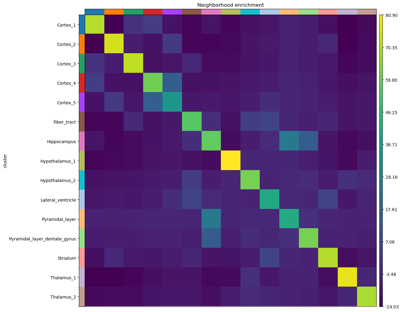
Given the spatial organization of the mouse brain coronal section, not surprisingly we find high neighborhood enrichment the Hippocampus region: Pyramidal_layer_dentate_gyrus and Pyramidal_layer clusters seems to be often neighbors with the larger Hippocampus cluster.
Co-occurrence across spatial dimensions
In addition to the neighbor enrichment score, we can visualize cluster co-occurrence in spatial dimensions. This is a similar analysis of the one presented above, yet it does not operate on the connectivity matrix, but on the original spatial coordinates. The co-occurrence score is defined as:
.. math:: \frac{p(exp|cond)}{p(exp)}
where \(p(exp|cond)\) is the conditional probability of observing a cluster \(exp\) conditioned on the presence of a cluster \(cond\), whereas \(p(exp)\) is the probability of observing \(exp\) in the radius size of interest. The score is computed across increasing radii size around each observation (i.e. spots here) in the tissue.
We are gonna compute such score with squidpy.gr.co_occurrence() and set the cluster annotation
for the conditional probability with the argument clusters.
Then, we visualize the results with squidpy.pl.co_occurrence().
sq.gr.co_occurrence(adata, cluster_key="cluster")
sq.pl.co_occurrence(
    adata,
    cluster_key="cluster",
    clusters="Hippocampus",
    figsize=(8, 4),
)
100%|██████████| 1/1 [00:07<00:00, 7.11s/]
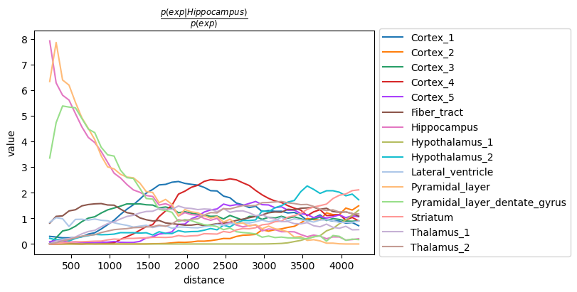
The result largely recapitulates the previous analysis:
the Pyramidal_layer cluster seem to co-occur at short distances
with the larger Hippocampus cluster.
It should be noted that the distance units are given in pixels of
the Visium source_image, and corresponds to the same unit of
the spatial coordinates saved in adata.obsm['spatial'].
Ligand-receptor interaction analysis
We are continuing the analysis showing couple of feature-level methods that are very relevant
for the analysis of spatial molecular data. For instance, after
quantification of cluster co-occurrence,
we might be interested in finding molecular instances
that could potentially drive cellular communication.
This naturally translates in a ligand-receptor interaction analysis.
In Squidpy, we provide a fast re-implementation the popular method CellPhoneDB [Efremova et al., 2020]
(code <https://github.com/Teichlab/cellphonedb>_ )
and extended its database of annotated ligand-receptor interaction pairs with
the popular database Omnipath [Türei et al., 2016].
You can run the analysis for all clusters pairs, and all genes (in seconds,
without leaving this notebook), with squidpy.gr.ligrec().
Furthermore, we’ll directly visualize the results, filtering out lowly-expressed genes
(with the means_range argument) and increasing the threshold for
the adjusted p-value (with the alpha argument).
We’ll also subset the visualization for only one source group,
the Hippocampus cluster, and two target groups, Pyramidal_layer_dentate_gyrus and Pyramidal_layer cluster.
sq.gr.ligrec(
    adata,
    n_perms=100,
    cluster_key="cluster",
)
sq.pl.ligrec(
    adata,
    cluster_key="cluster",
    source_groups="Hippocampus",
    target_groups=["Pyramidal_layer", "Pyramidal_layer_dentate_gyrus"],
    means_range=(3, np.inf),
    alpha=1e-4,
    swap_axes=True,
)
100%|██████████| 100/100 [00:16<00:00, 5.93permutation/s]

The dotplot visualization provides an interesting set of candidate ligand-receptor annotation that could be involved in cellular interactions in the Hippocampus. A more refined analysis would be for instance to integrate these results with the results of a deconvolution method, to understand what’s the proportion of single-cell cell types present in this region of the tissue.
Spatially variable genes with Moran’s I
Finally, we might be interested in finding genes that show spatial patterns. There are several methods that aimed at address this explicitly, based on point processes or Gaussian process regression framework:
SPARK -
paper <https://www.nature.com/articles/s41592-019-0701-7#Abs1>,code <https://github.com/xzhoulab/SPARK>.Spatial DE -
paper <https://www.nature.com/articles/nmeth.4636>,code <https://github.com/Teichlab/SpatialDE>.trendsceek -
paper <https://www.nature.com/articles/nmeth.4634>,code <https://github.com/edsgard/trendsceek>.HMRF -
paper <https://www.nature.com/articles/nbt.4260>,code <https://bitbucket.org/qzhudfci/smfishhmrf-py>.
Here, we provide a simple approach based on the well-known
Moran's I statistics <https://en.wikipedia.org/wiki/Moran%27s_I>_
which is in fact used also as a baseline method in the spatially variable gene papers listed above.
The function in Squidpy is called squidpy.gr.spatial_autocorr(), and
returns both test statistics and adjusted p-values in anndata.AnnData.var slot.
For time reasons, we will evaluate a subset of the highly variable genes only.
genes = adata[:, adata.var.highly_variable].var_names.values[:1000]
sq.gr.spatial_autocorr(
    adata,
    mode="moran",
    genes=genes,
    n_perms=100,
    n_jobs=1,
)
100%|██████████| 100/100 [00:47<00:00, 2.11/s]
The results are saved in adata.uns['moranI'] slot.
Genes have already been sorted by Moran’s I statistic.
adata.uns["moranI"].head(10)
| I | pval_norm | var_norm | pval_z_sim | pval_sim | var_sim | pval_norm_fdr_bh | pval_z_sim_fdr_bh | pval_sim_fdr_bh | |
|---|---|---|---|---|---|---|---|---|---|
| Olfm1 | 0.763291 | 0.0 | 0.000131 | 0.0 | 0.009901 | 0.000220 | 0.0 | 0.0 | 0.011648 |
| Plp1 | 0.747660 | 0.0 | 0.000131 | 0.0 | 0.009901 | 0.000268 | 0.0 | 0.0 | 0.011648 |
| Itpka | 0.727076 | 0.0 | 0.000131 | 0.0 | 0.009901 | 0.000216 | 0.0 | 0.0 | 0.011648 |
| Snap25 | 0.720987 | 0.0 | 0.000131 | 0.0 | 0.009901 | 0.000237 | 0.0 | 0.0 | 0.011648 |
| Nnat | 0.708637 | 0.0 | 0.000131 | 0.0 | 0.009901 | 0.000282 | 0.0 | 0.0 | 0.011648 |
| Ppp3ca | 0.693320 | 0.0 | 0.000131 | 0.0 | 0.009901 | 0.000232 | 0.0 | 0.0 | 0.011648 |
| Chn1 | 0.684957 | 0.0 | 0.000131 | 0.0 | 0.009901 | 0.000281 | 0.0 | 0.0 | 0.011648 |
| Mal | 0.679775 | 0.0 | 0.000131 | 0.0 | 0.009901 | 0.000293 | 0.0 | 0.0 | 0.011648 |
| Tmsb4x | 0.676719 | 0.0 | 0.000131 | 0.0 | 0.009901 | 0.000246 | 0.0 | 0.0 | 0.011648 |
| Cldn11 | 0.674110 | 0.0 | 0.000131 | 0.0 | 0.009901 | 0.000270 | 0.0 | 0.0 | 0.011648 |
We can select few genes and visualize their expression levels in the tissue with squidpy.pl.spatial_scatter().
sq.pl.spatial_scatter(adata, color=["Olfm1", "Plp1", "Itpka", "cluster"])
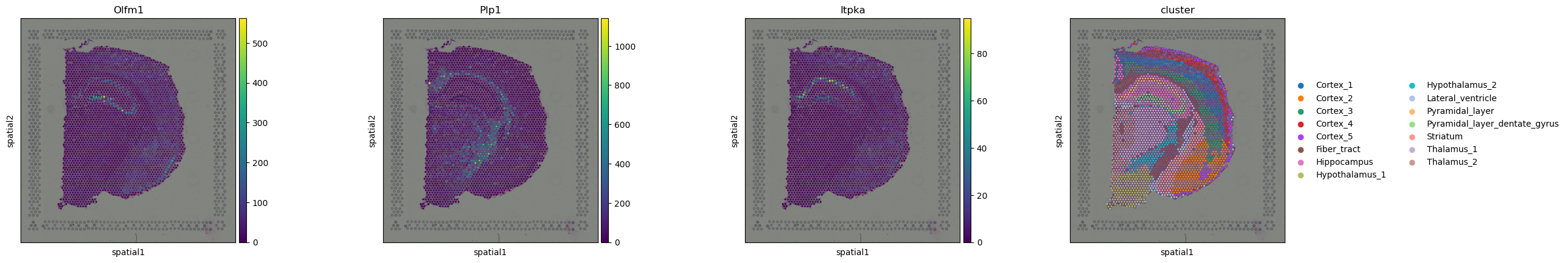
Interestingly, some of these genes seems to be related to the pyramidal layers and the fiber tract.