%matplotlib inline
Analyze seqFISH data
This tutorial shows how to apply Squidpy for the analysis of seqFISH data.
The data used here was obtained from [Lohoff et al., 2020].
We provide a pre-processed subset of the data, in anndata.AnnData format.
For details on how it was pre-processed, please refer to the original paper.
Import packages & data
To run the notebook locally, create a conda environment as conda env create -f environment.yml using this
environment.yml <https://github.com/scverse/squidpy_notebooks/blob/main/environment.yml>_.
import numpy as np

import scanpy as sc
import squidpy as sq

sc.logging.print_header()
print(f"squidpy=={sq.__version__}")

# load the pre-processed dataset
adata = sq.datasets.seqfish()
scanpy==1.9.2 anndata==0.8.0 umap==0.5.3 numpy==1.23.5 scipy==1.9.3 pandas==1.5.1 scikit-learn==1.1.3 statsmodels==0.13.2 python-igraph==0.10.2 pynndescent==0.5.7
squidpy==1.2.3
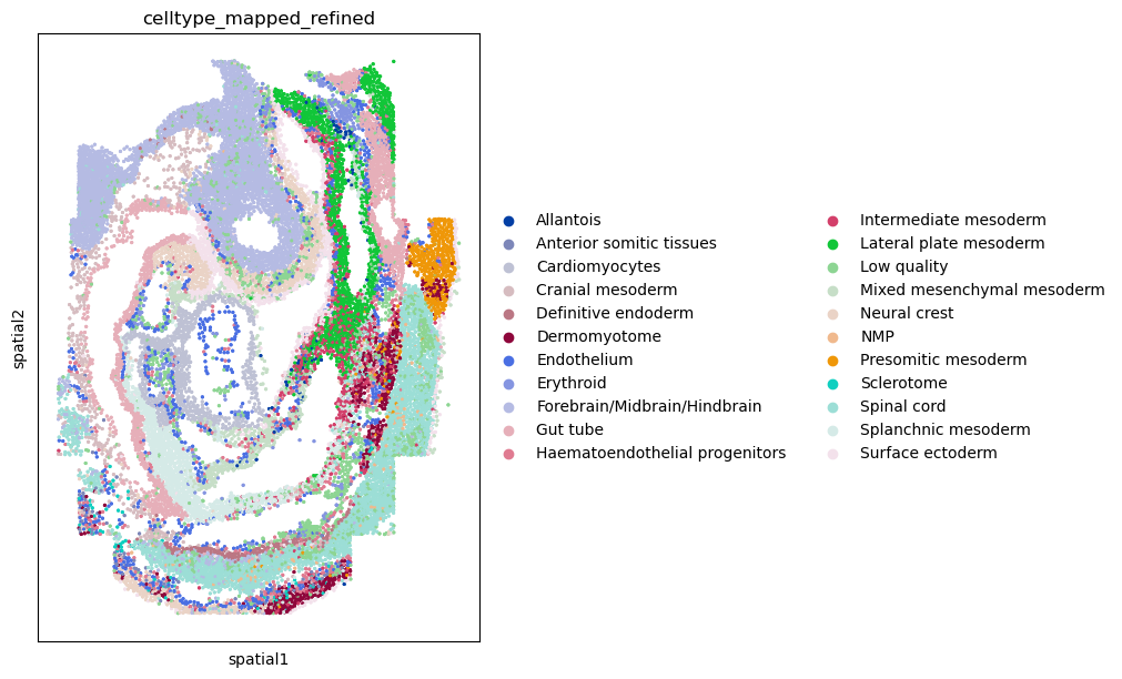
First, let’s visualize cluster annotation in spatial context
with squidpy.pl.spatial_scatter().
sq.pl.spatial_scatter(
    adata, color="celltype_mapped_refined", shape=None, figsize=(10, 10)
)
WARNING: Please specify a valid `library_id` or set it permanently in `adata.uns['spatial']`
Neighborhood enrichment analysis
Similar to other spatial data, we can investigate spatial organization of clusters
in a quantitative way, by computing a neighborhood enrichment score.
You can compute such score with the following function: squidpy.gr.nhood_enrichment().
In short, it’s an enrichment score on spatial proximity of clusters:
if spots belonging to two different clusters are often close to each other,
then they will have a high score and can be defined as being enriched.
On the other hand, if they are far apart, the score will be low
and they can be defined as depleted.
This score is based on a permutation-based test, and you can set
the number of permutations with the n_perms argument (default is 1000).
Since the function works on a connectivity matrix, we need to compute that as well.
This can be done with squidpy.gr.spatial_neighbors().
Please see Building spatial neighbors graph for more details
of how this function works.
Finally, we’ll directly visualize the results with squidpy.pl.nhood_enrichment().
We’ll add a dendrogram to the heatmap computed with linkage method ward.
sq.gr.spatial_neighbors(adata, coord_type="generic")
sq.gr.nhood_enrichment(adata, cluster_key="celltype_mapped_refined")
sq.pl.nhood_enrichment(adata, cluster_key="celltype_mapped_refined", method="ward")
100%|██████████| 1000/1000 [00:07<00:00, 125.61/s]
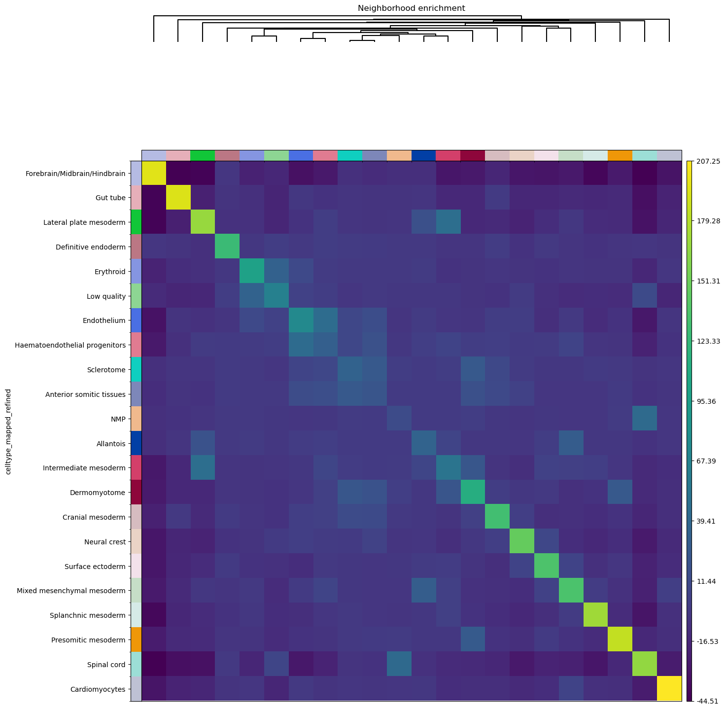
A similar analysis was performed in the original publication [Lohoff et al., 2020], and we can appreciate to what extent results overlap. For instance, there seems to be an enrichment between the Lateral plate mesoderm, the Intermediate mesoderm and a milder enrichment for Allantois cells. As in the original publication, there also seems to be an association between the Endothelium and the Haematoendothelial progenitors. Of course, results do not perfectly overlap, and this could be due to several factors:
the construction of the neighbors graph (which in our case is not informed by the radius, as we did not have access to this information).
the number of permutation of the neighborhood enrichment (500 in the original publication against the default 1000 in our implementation).
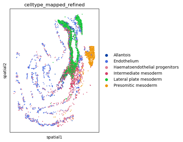
We can also visualize the spatial organization of cells again,
and appreciate the proximity of specific cell clusters.
For this, we’ll use squidpy.pl.spatial_scatter() again.
sq.pl.spatial_scatter(
    adata,
    color="celltype_mapped_refined",
    groups=[
        "Endothelium",
        "Haematoendothelial progenitors",
        "Allantois",
        "Lateral plate mesoderm",
        "Intermediate mesoderm",
        "Presomitic mesoderm",
    ],
    shape=None,
    size=2,
)
WARNING: Please specify a valid `library_id` or set it permanently in `adata.uns['spatial']`
Co-occurrence across spatial dimensions
In addition to the neighbor enrichment score, we can visualize cluster co-occurrence in spatial dimensions. This is a similar analysis of the one presented above, yet it does not operate on the connectivity matrix, but on the original spatial coordinates. The co-occurrence score is defined as:
.. math::
\frac{p(exp|cond)}{p(exp)}
where \(p(exp|cond)\) is the conditional probability of observing a cluster \(exp\) conditioned on the presence of a cluster \(cond\), whereas \(p(exp)\) is the probability of observing \(exp\) in the radius size of interest. The score is computed across increasing radii size around each cell in the tissue.
We can compute this score with squidpy.gr.co_occurrence()
and set the cluster annotation for the conditional probability with
the argument clusters. Then, we visualize the results with
squidpy.pl.co_occurrence().
sq.gr.co_occurrence(adata, cluster_key="celltype_mapped_refined")
sq.pl.co_occurrence(
    adata,
    cluster_key="celltype_mapped_refined",
    clusters="Lateral plate mesoderm",
    figsize=(10, 5),
)
100%|██████████| 1/1 [00:37<00:00, 37.70s/]
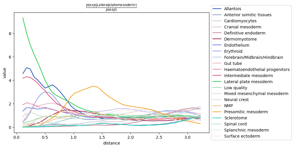
It seems to recapitulate a previous observation, that there is a co-occurrence between the
conditional cell type annotation Lateral plate mesoderm and the clusters
Intermediate mesoderm and Allantois.
It also seems that at longer distances, there is a co-occurrence of cells belonging to
the Presomitic mesoderm cluster. By visualizing the full tissue as before we can indeed
appreciate that these cell types seems to form a defined clusters relatively close
to the Lateral plate mesoderm cells.
It should be noted that the distance units corresponds to
the spatial coordinates saved in adata.obsm['spatial'].
Ligand-receptor interaction analysis
The analysis showed above has provided us with quantitative information on
cellular organization and communication at the tissue level.
We might be interested in getting a list of potential candidates that might be driving
such cellular communication.
This naturally translates in doing a ligand-receptor interaction analysis.
In Squidpy, we provide a fast re-implementation the popular method CellPhoneDB [Efremova et al., 2020]
(code <https://github.com/Teichlab/cellphonedb>_)
and extended its database of annotated ligand-receptor interaction pairs with
the popular database Omnipath [Türei et al., 2016].
You can run the analysis for all clusters pairs, and all genes (in seconds,
without leaving this notebook), with squidpy.gr.ligrec().
Let’s perform the analysis and visualize the result for three clusters of
interest: Lateral plate mesoderm,
Intermediate mesoderm and Allantois. For the visualization, we will
filter out annotations
with low-expressed genes (with the means_range argument)
and decreasing the threshold for the adjusted p-value (with the alpha argument).
sq.gr.ligrec(
    adata,
    n_perms=100,
    cluster_key="celltype_mapped_refined",
)
sq.pl.ligrec(
    adata,
    cluster_key="celltype_mapped_refined",
    source_groups="Lateral plate mesoderm",
    target_groups=["Intermediate mesoderm", "Allantois"],
    means_range=(0.3, np.inf),
    alpha=1e-4,
    swap_axes=True,
)
9.39MB [00:00, 26.9MB/s]
1.52MB [00:00, 17.4MB/s]
3.80MB [00:00, 25.3MB/s]
100%|██████████| 100/100 [00:11<00:00,  8.81permutation/s]
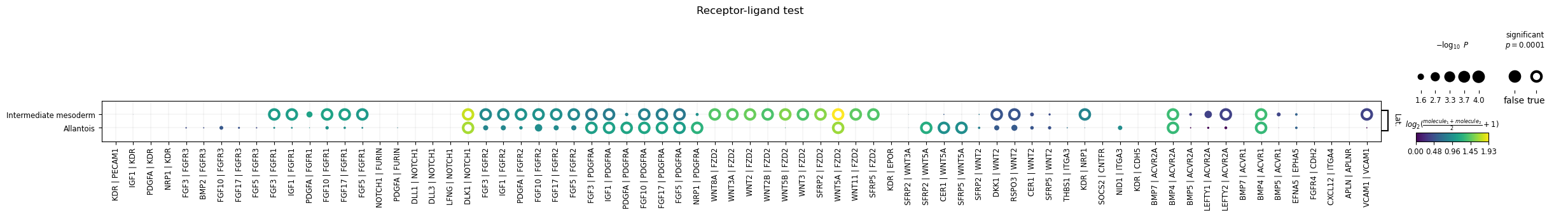
The dotplot visualization provides an interesting set of candidate interactions that could be involved in the tissue organization of the cell types of interest. It should be noted that this method is a pure re-implementation of the original permutation-based test, and therefore retains all its caveats and should be interpreted accordingly.