%matplotlib inline
Plot segmentation masks
This example shows how to use squidpy.pl.spatial_segment to plot
segmentation masks and features in anndata.AnnData.
This plotting is useful when segmentation masks and underlying image are available.
See also
See {doc}`plot_scatter` for scatter plot.
import squidpy as sq

adata = sq.datasets.mibitof()
adata.uns["spatial"].keys()
dict_keys(['point16', 'point23', 'point8'])
In this dataset we have 3 unique keys, which means that there are 3
unique `library_id[. As detailed in
{ref}`sphx_glr_auto_tutorials_tutorial_read_spatial.py]{.title-ref},
it means that there are 3 unique field of views (FOV) in this dataset.
The information to link the library ids to the observations are stored
in anndata.AnnData.obs.
adata.obs
| row_num | point | cell_id | X1 | center_rowcoord | center_colcoord | cell_size | category | donor | Cluster | batch | library_id | |
|---|---|---|---|---|---|---|---|---|---|---|---|---|
| 3034-0 | 3086 | 23 | 2 | 60316.0 | 269.0 | 7.0 | 408.0 | carcinoma | 21d7 | Epithelial | 0 | point23 |
| 3035-0 | 3087 | 23 | 3 | 60317.0 | 294.0 | 6.0 | 408.0 | carcinoma | 21d7 | Epithelial | 0 | point23 |
| 3036-0 | 3088 | 23 | 4 | 60318.0 | 338.0 | 4.0 | 304.0 | carcinoma | 21d7 | Imm_other | 0 | point23 |
| 3037-0 | 3089 | 23 | 6 | 60320.0 | 372.0 | 6.0 | 219.0 | carcinoma | 21d7 | Myeloid_CD11c | 0 | point23 |
| 3038-0 | 3090 | 23 | 8 | 60322.0 | 417.0 | 5.0 | 303.0 | carcinoma | 21d7 | Myeloid_CD11c | 0 | point23 |
| ... | ... | ... | ... | ... | ... | ... | ... | ... | ... | ... | ... | ... |
| 47342-2 | 48953 | 16 | 1103 | 2779.0 | 143.0 | 1016.0 | 283.0 | carcinoma | 90de | Fibroblast | 2 | point16 |
| 47343-2 | 48954 | 16 | 1104 | 2780.0 | 814.0 | 1017.0 | 147.0 | carcinoma | 90de | Fibroblast | 2 | point16 |
| 47344-2 | 48955 | 16 | 1105 | 2781.0 | 874.0 | 1018.0 | 142.0 | carcinoma | 90de | Imm_other | 2 | point16 |
| 47345-2 | 48956 | 16 | 1106 | 2782.0 | 257.0 | 1019.0 | 108.0 | carcinoma | 90de | Fibroblast | 2 | point16 |
| 47346-2 | 48957 | 16 | 1107 | 2783.0 | 533.0 | 1019.0 | 111.0 | carcinoma | 90de | Fibroblast | 2 | point16 |
3309 rows × 12 columns
Specifically, the key `library_id[ in
{attr}`adata.obs]{.title-ref} contains the same unique values contained
in anndata.AnnData.uns. We can visualize the 3 spatial dataset with
squidpy.pl.spatial_segment.
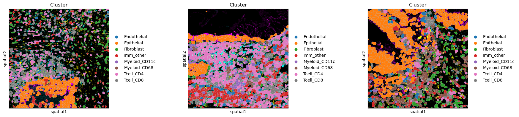
sq.pl.spatial_segment(
    adata, color="Cluster", library_key="library_id", seg_cell_id="cell_id"
)
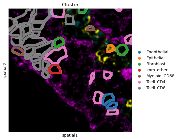
There are several parameters that can be controlled. For instance, it is possible to plot segmentation masks as “contours”, in order to visualize the underlying image. Let’s visualize it for one specific cropped FOV.
sq.pl.spatial_segment(
    adata,
    color="Cluster",
    library_key="library_id",
    library_id="point8",
    seg_cell_id="cell_id",
    seg_contourpx=10,
    crop_coord=[(0, 0, 300, 300)],
)
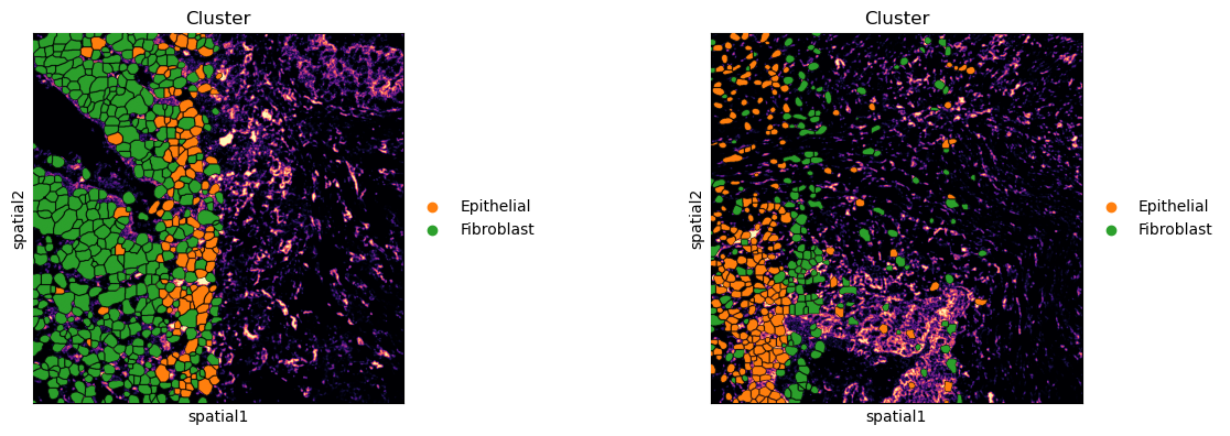
It’s also possible to add an outline to better distinguish segmentation masks’ boundaries. Furthermore, the underlying image can be removed, gray scaled or single channels can be plotted.
sq.pl.spatial_segment(
    adata,
    color="Cluster",
    groups=["Fibroblast", "Epithelial"],
    library_key="library_id",
    library_id=["point8", "point16"],
    seg_cell_id="cell_id",
    seg_outline=True,
    img_channel=0,
    img_cmap="magma",
)
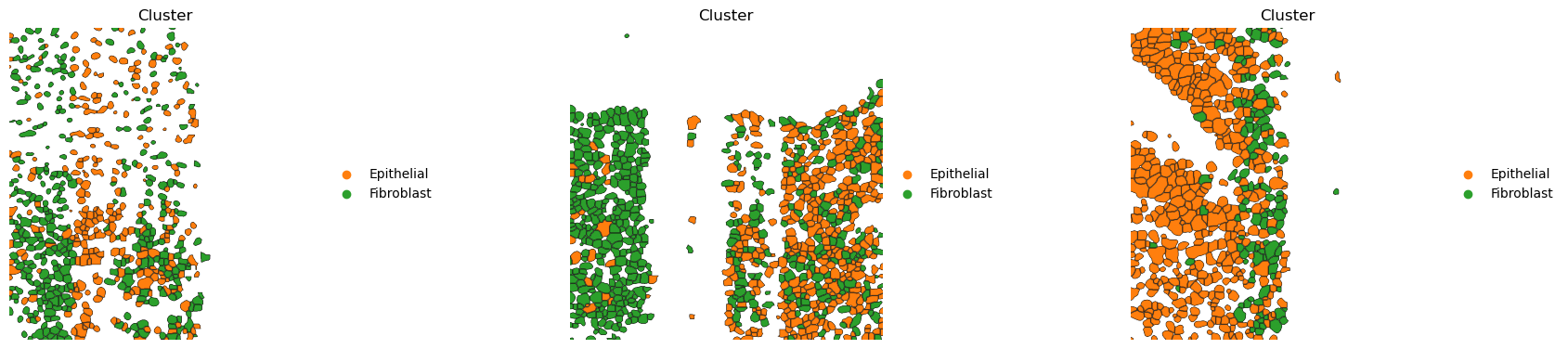
If groups of observations are plotted (as above), it’s possible to modify whether to “visualize” the segmentation masks that do not belong to any selected group. It is set as “transparent” by default (see above) but in cases where e.g. no image is present it can be useful to visualize them nonetheless
sq.pl.spatial_segment(
    adata,
    color="Cluster",
    groups=["Fibroblast", "Epithelial"],
    library_key="library_id",
    seg_cell_id="cell_id",
    seg_outline=True,
    img=False,
    frameon=False,
)
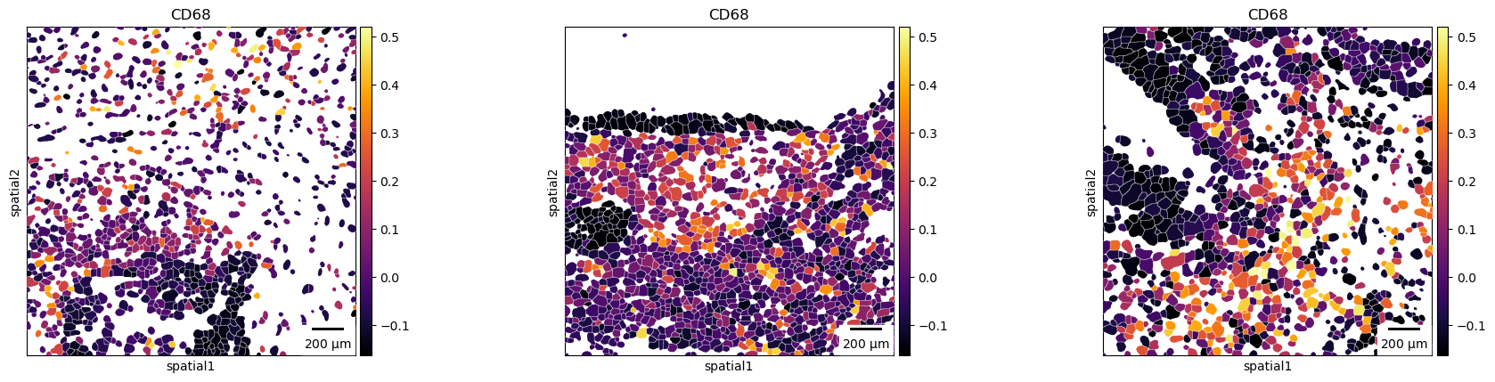
Finally, a scale bar can be added, where size and pixel units must be passed. The size for this example are not the real values and are for purely visualization purposes.
sq.pl.spatial_segment(
    adata,
    color="CD68",
    library_key="library_id",
    seg_cell_id="cell_id",
    img=False,
    cmap="inferno",
    scalebar_dx=2.0,
    scalebar_kwargs={"scale_loc": "bottom", "location": "lower right"},
)